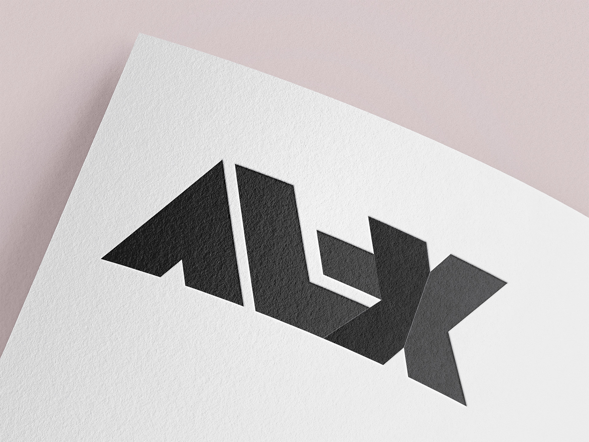
My personal logo was developed with the aim of reflecting my work as a designer. The geometric shapes and clear typography symbolize precision and simplicity, while the angled cuts convey dynamism and modernity. I wanted to create a timeless design that is versatile and clearly communicates my style.
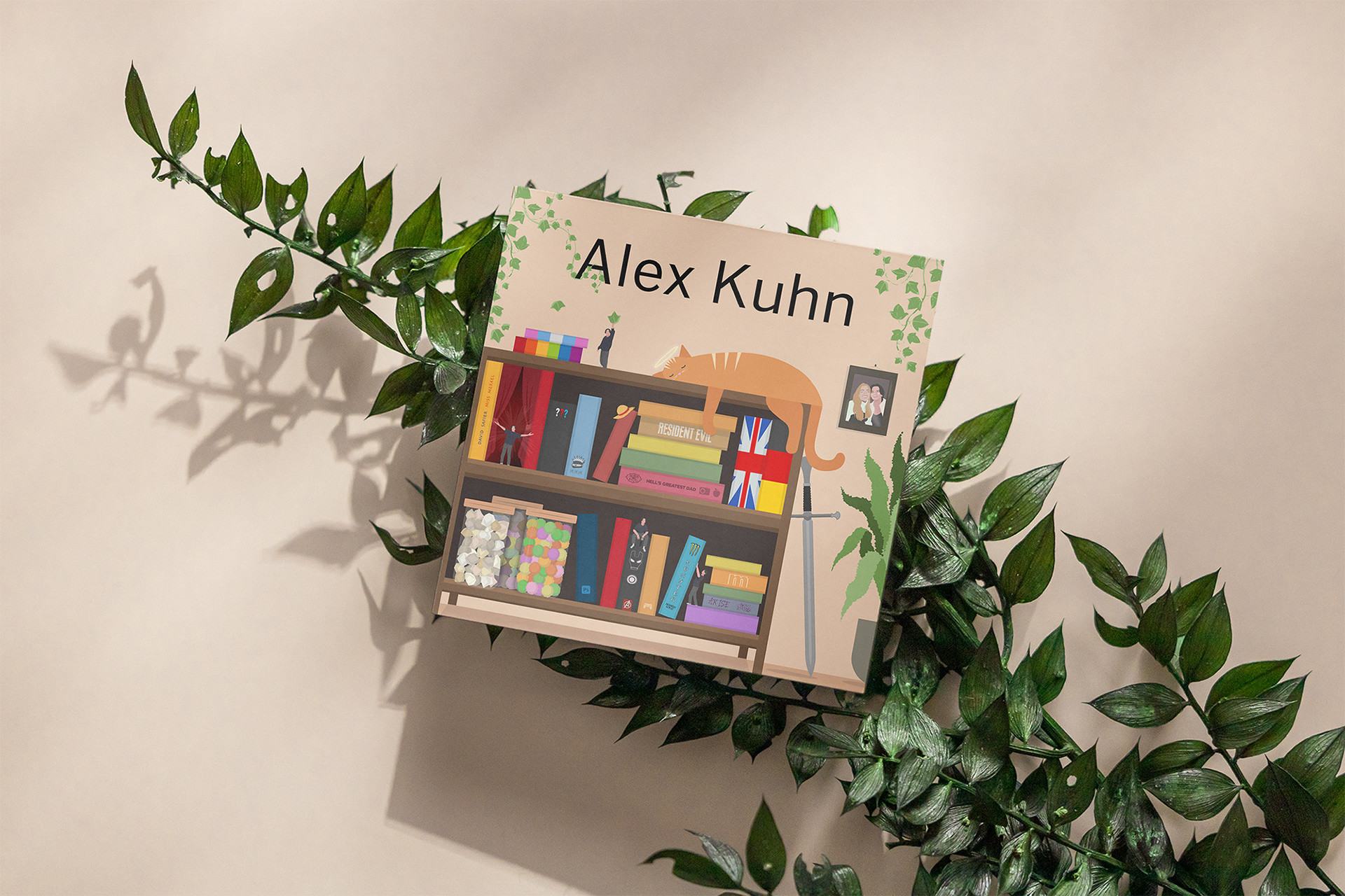
The flyer is a very personal work in which I have incorporated many details and elements that reflect me and my interests. The idea was to create a shelf with objects and books that tell stories about me. With a clear color palette and small, thoughtful details, I created a playful yet orderly composition.

The infographic summarizes important information about the world of One Piece. The color-coded sections and clear icons make it easy to find your way around. I wanted to create a design that is not only informative, but also visually fun and fits the theme of the anime.

This three-part work shows different facets of London, from iconic landmarks such as the London Eye to modern skylines. Each image was shot and post-processed by me to enhance the detail and color. The aim was to show the diversity and character of the city in a cohesive series.
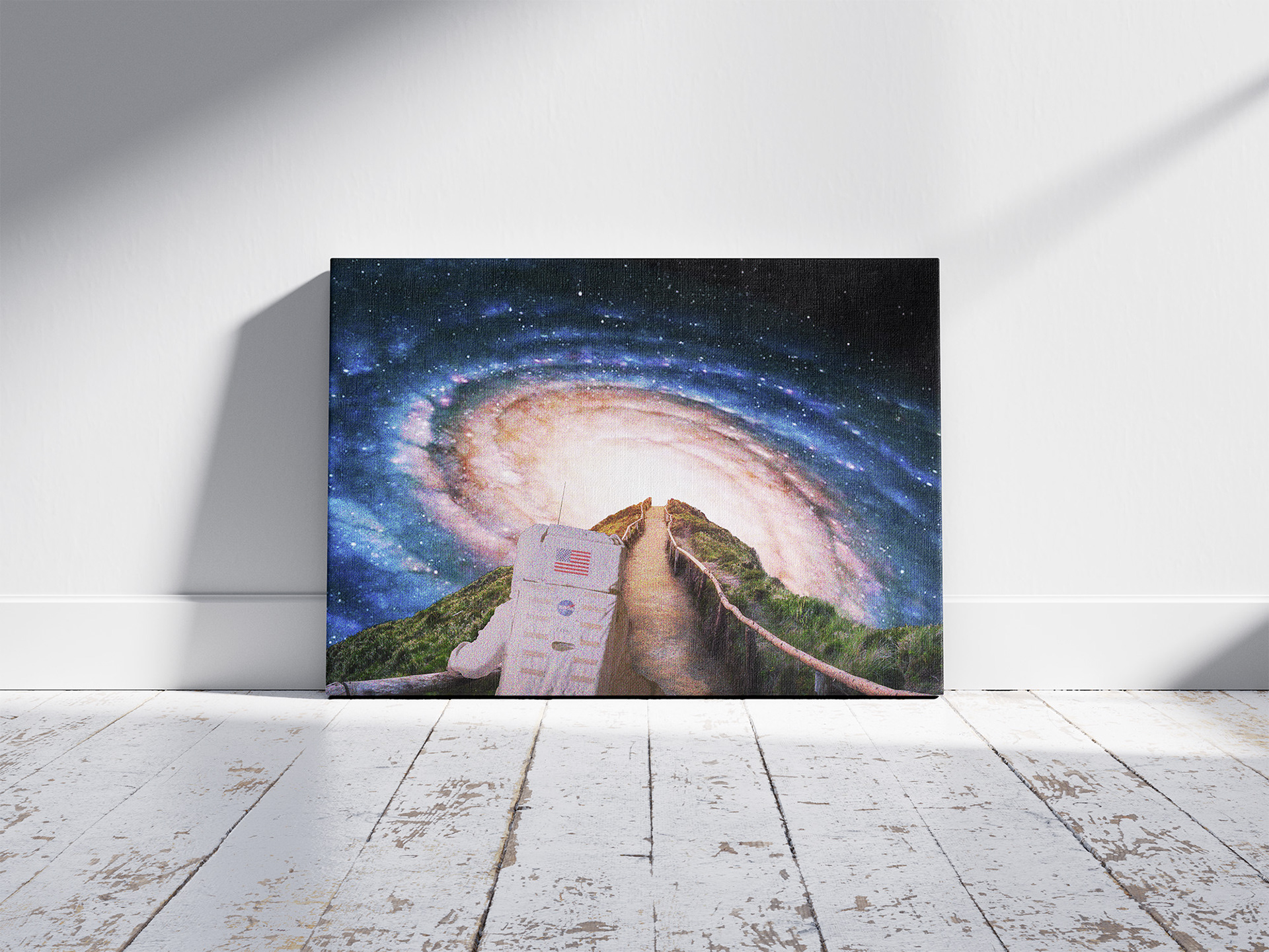
In this work, I wanted to depict the contrast between a down-to-earth, terrestrial landscape and the infinity of space. The astronaut symbolizes curiosity and a sense of adventure, while the path creates a link between reality and fantasy. I worked with color and light to emphasize the mysticism of the universe.

Here I have depicted the world of books as a tangible, inhabitable city. Each book was designed as its own building to visualise the diversity of knowledge and stories. With warm colours and a sunset in the background, I wanted to create an inviting and magical atmosphere that makes you want to read.

The work shows a house floating in the clouds - a symbol of freedom and fantasy. The decision to use cool blue tones and delicate cloud formations emphases the lightness of the scene. With the protective glass dome element, I have created a feeling of security in this surreal world.
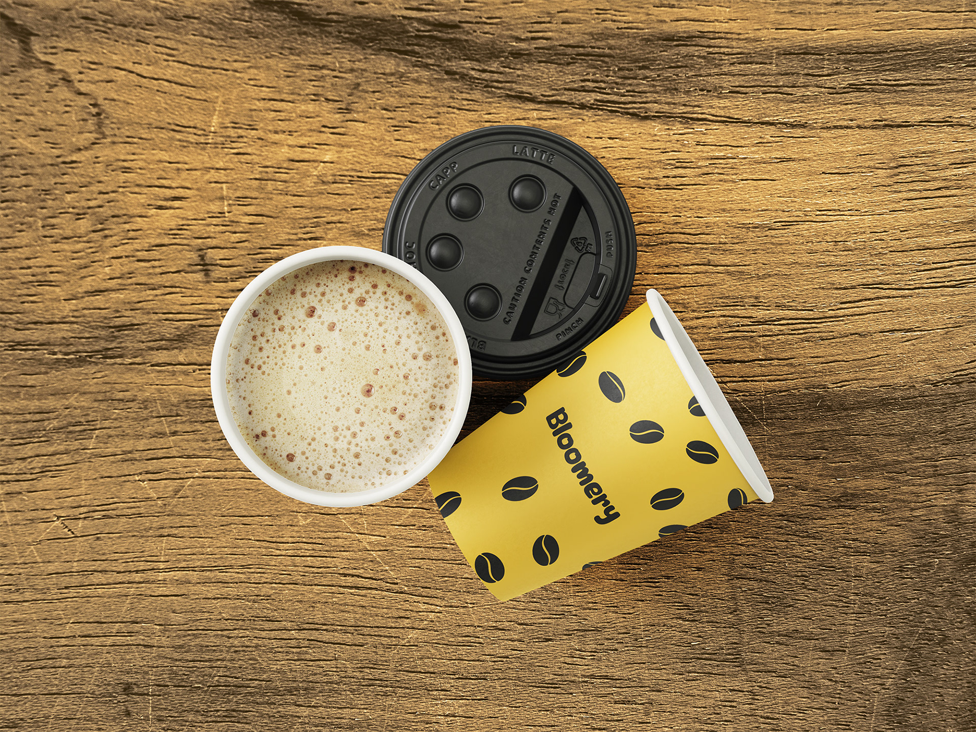
The cup design for "Bloomery" combines a bright yellow colour with a clear pattern of coffee beans to make the brand look friendly and memorable.
Yellow was chosen to radiate energy and warmth, while the beans put the product right in the center. The design had to be easily recognizable and visually underline the coffee moment for the customer.
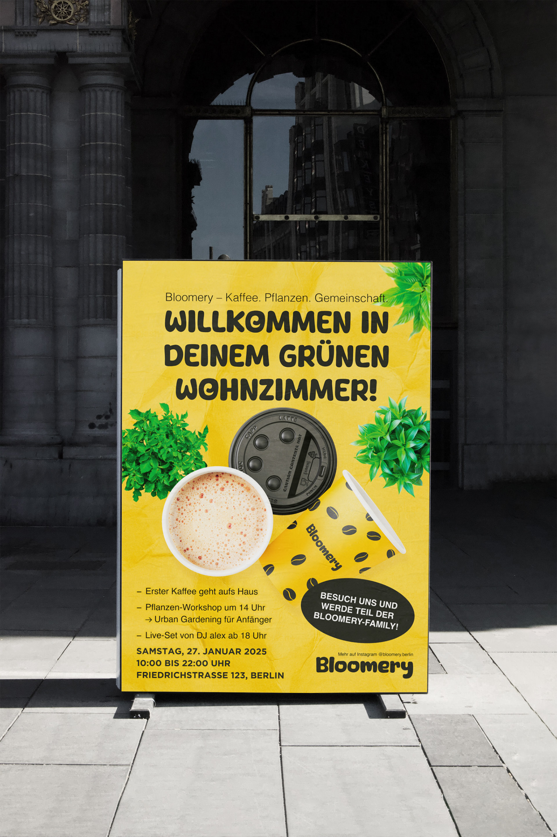
For the poster, I opted for an inviting combination of friendly yellow and green accents to present Bloomery as a modern, sustainable meeting place. The arrangement of the content guides the eye intuitively to the most important information. The aim was to convey a feel-good place that combines coffee, plants and community.

The business card picks up on the corporate colors and adds a clear branding element with the coffee beans. The simple but modern look makes the card versatile, whether at meetings or in the shop. I deliberately focussed on an eye-catching but not overloaded design in order to combine professionalism and creativity.

The LevelUp logo takes center stage here: with its clear, geometric design language and minimalist elements, it embodies the essence of the brand - modern, dynamic and future-oriented. The blue color scheme complements the design perfectly, as it conveys trust and digitally. The aim was to develop a memorable logo that can be used in a variety of ways.
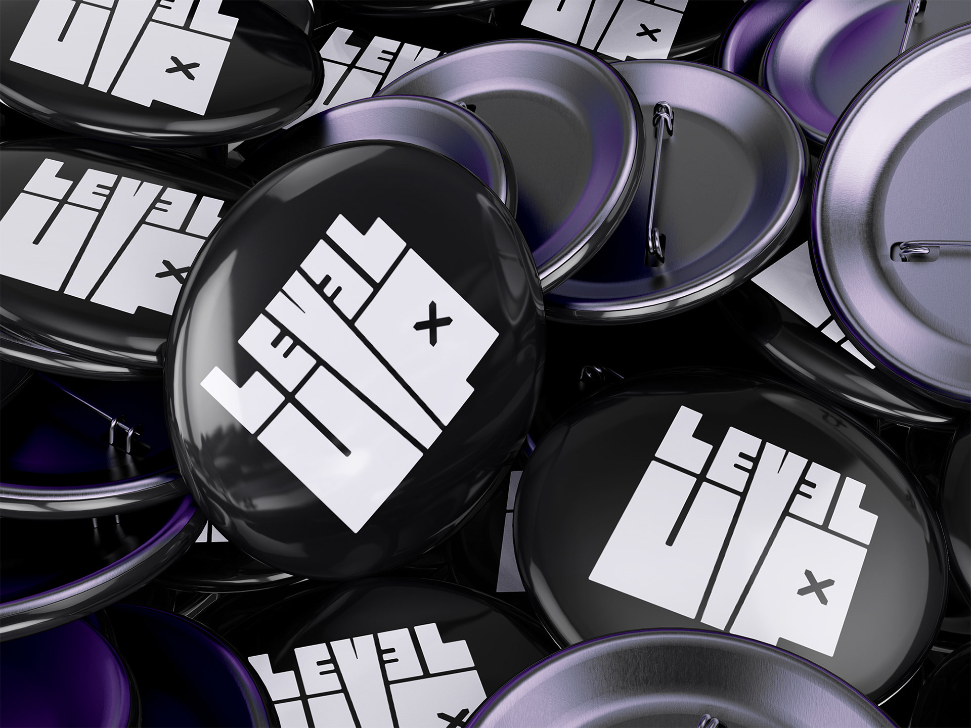
The buttons are part of the LevelUp merchandising and show the logo in its most minimalist form. The black and white color scheme underlines the modern, clean identity of the brand. The buttons are a simple but effective way to keep the branding present.

The business card for LevelUp combines modern design with functional clarity. The back contains a QR code that leads directly to the website - an easy way to direct interested parties to the brand.
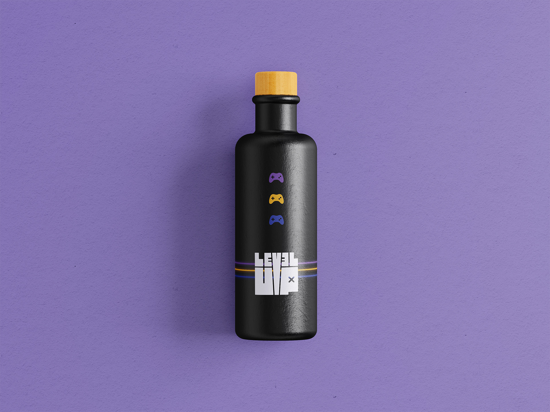
The LevelUp drinking bottle combines black with bright accents in purple, yellow and blue to emphasize the brand's gaming and lifestyle theme. The minimalist design and clean lines make for a modern, high-quality product that perfectly suits the target group.
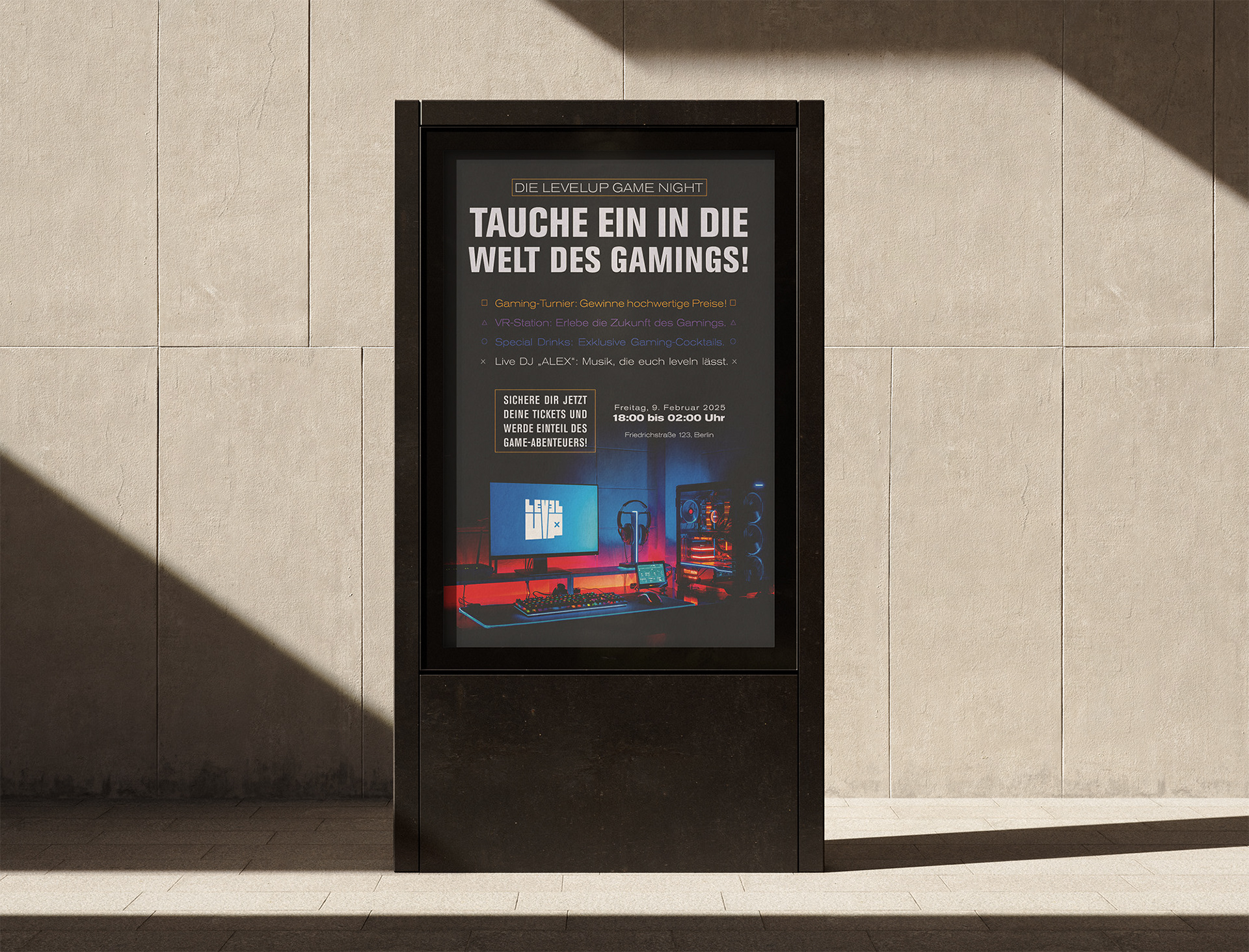
The poster was designed in such a way that it immediately catches the eye and conveys the most important information about the gaming night. Dark, rich colours meet bright highlights in purple and yellow to convey the energetic atmosphere of the event.
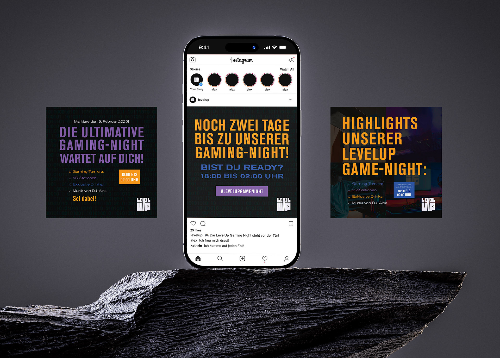
The social media posts pick up on LevelUp's corporate identity with strong contrasts and dynamic fonts. Each post is clearly structured and focussed in order to address the target group directly and motivate them to participate.
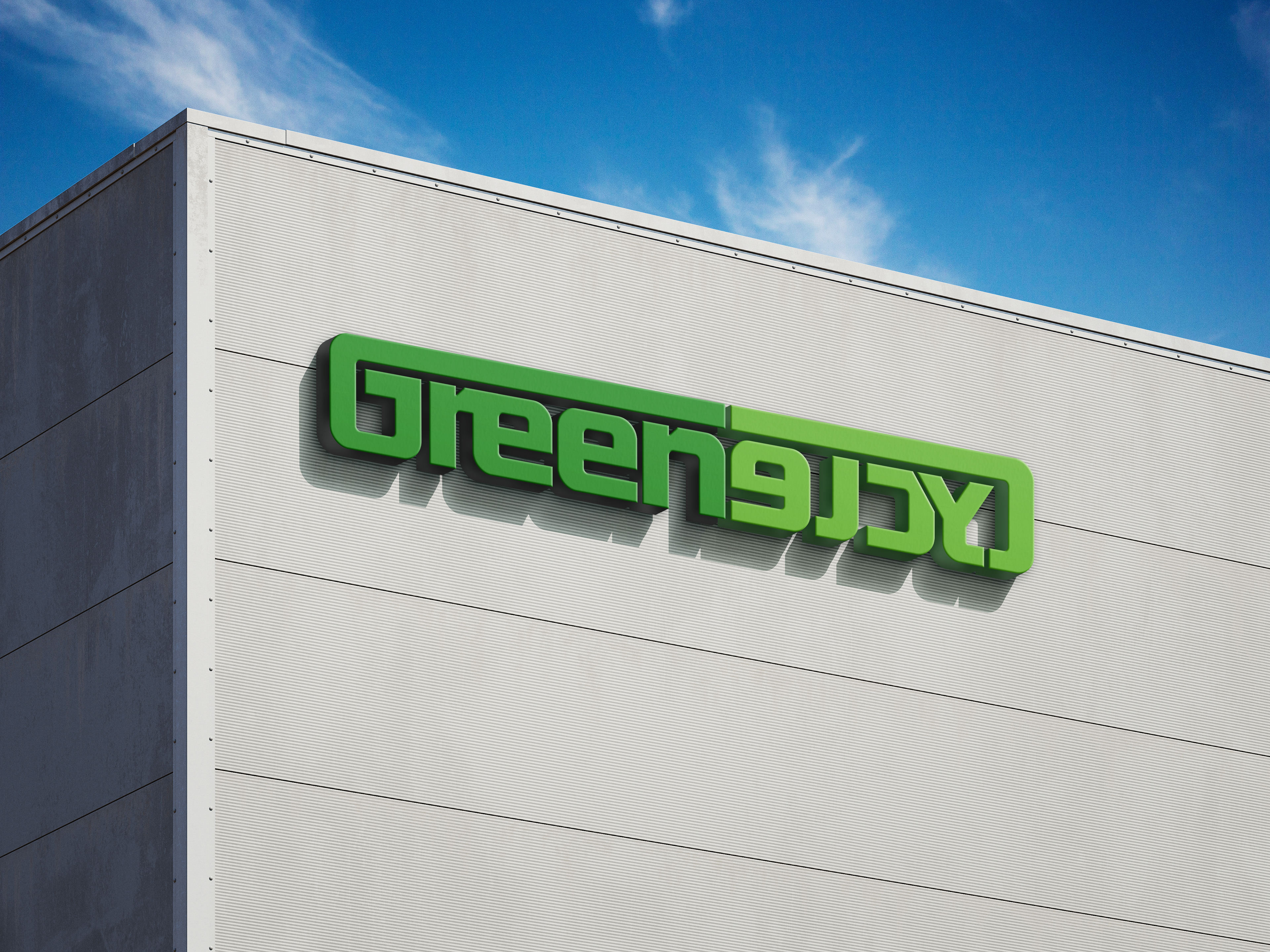
The logo was designed to be modern and environmentally conscious. The bold green color stands for sustainability, while the rounded shapes symbolize an approachable and friendly brand. The aim was to create a logo that both stands out and inspires confidence.
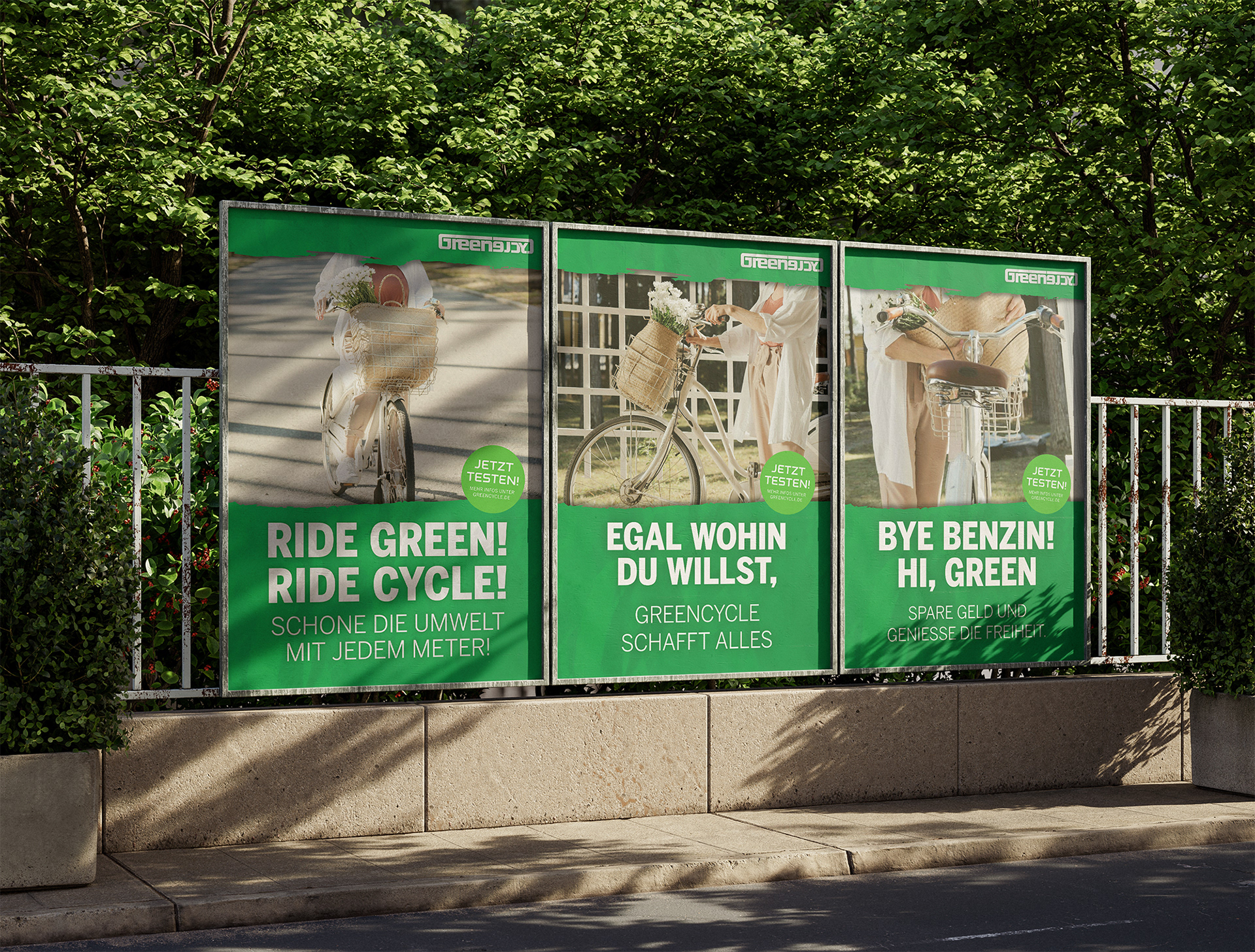
For Greencycle's poster campaign, I designed a series that works both individually and as a whole. The green color scheme and clear messages reflect the theme of sustainability. Each poster has its own focus, such as environmental friendliness or mobility, and speaks directly to customers. The images and text harmonize to inspire the target group and encourage them to get involved.
! Greencycle, bloomery and level up aren't real companies and are made up. !
– Greencycle is supposed to be a bike store for 20-50 year olds.
– Bloomery is supposed to be a café for young people in Berlin.
– Levelup is a Gaming lounge in Berlin for young gaming people.